Branding Vision
Marvel World of Heroes is the first game in the Marvel franchise where you can become your own Marvel superhero — in the real world.
Design Insights
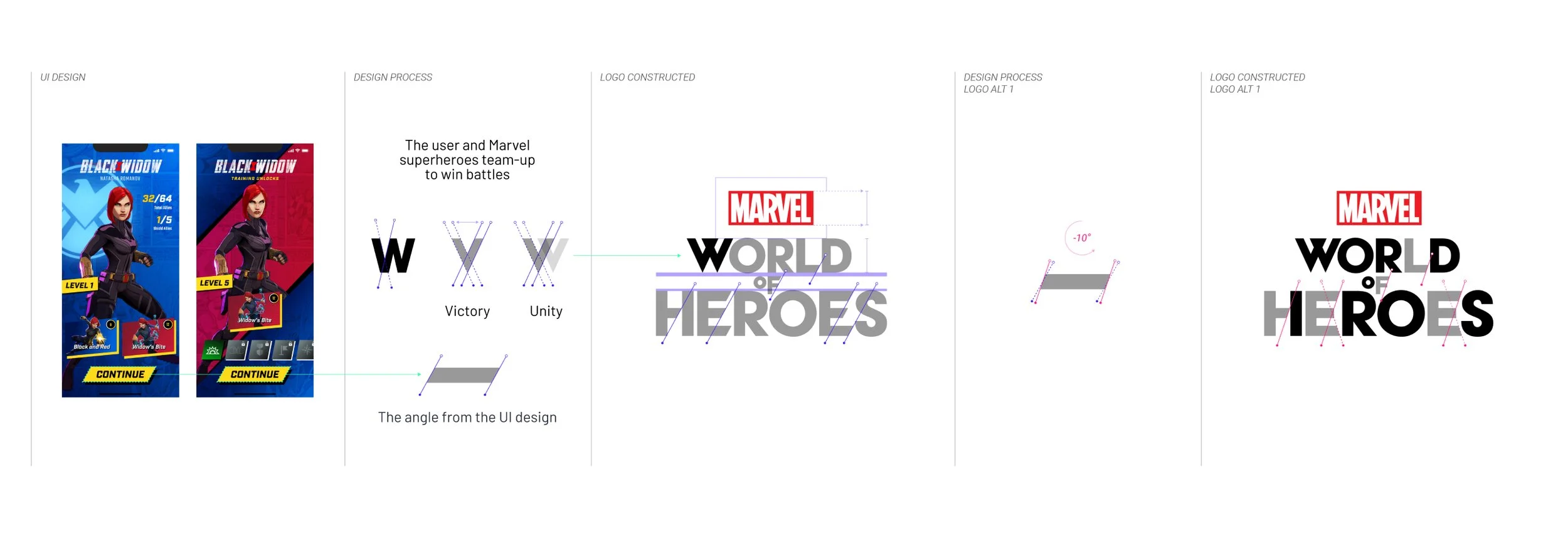
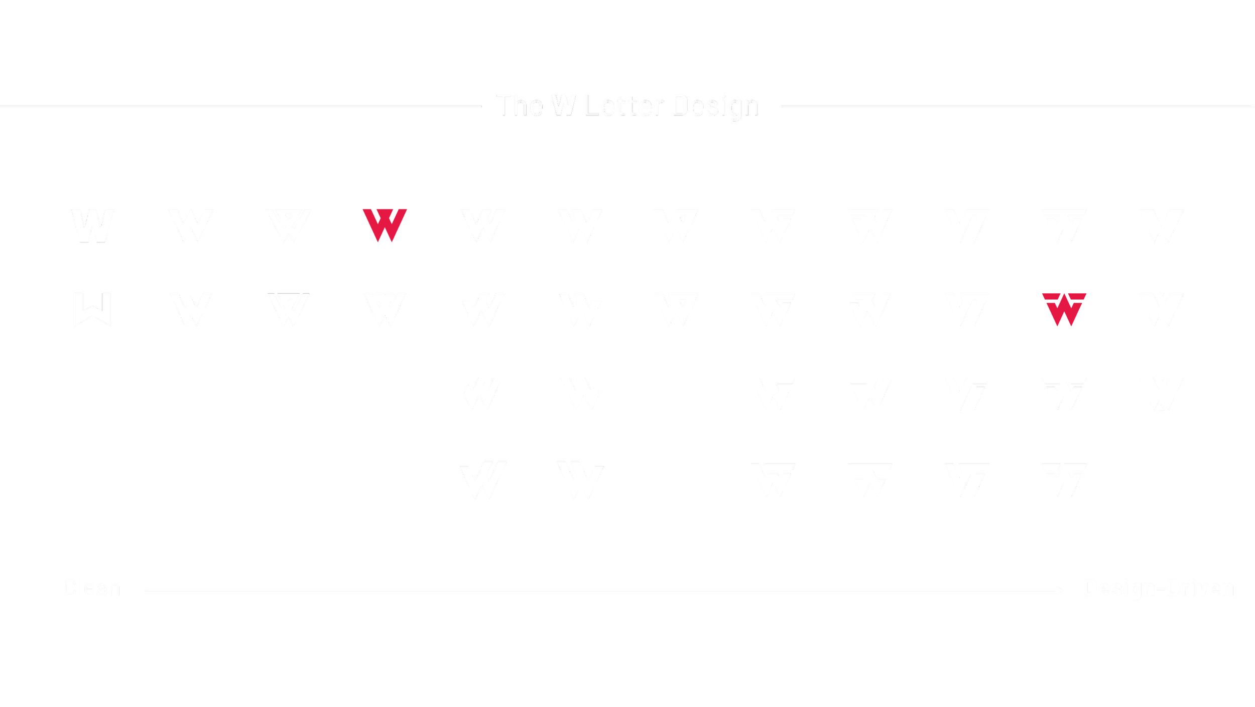
The logo is the single most essential element of the brand. It’s the core of everything the brand represents and believes. Therefore, we decided to approach the logo design as a manifestation of some of the most iconic core aspects of Marvel World of Heroes.
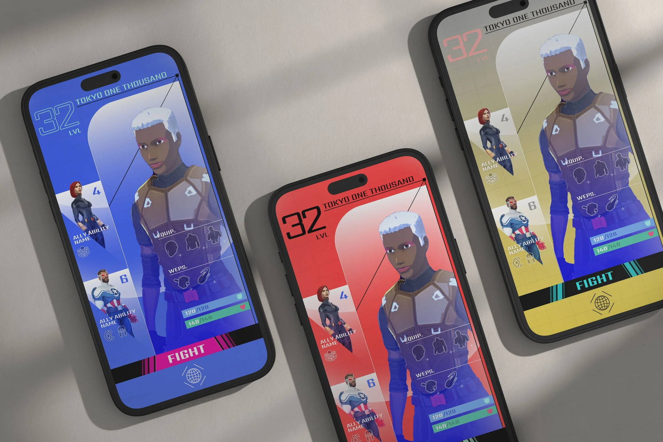
We adopted several design cues from the game UI to create the logo, including the UI panel/button angle used throughout, the unity between users and Marvel superheroes as they team up on the battlefield and the ability for the user to travel between realms via the Portal.
When you deal with a mega-franchise such as Marvel, it’s a tremendous challenge to collaborate with multiple departments and teams from the client side. The logo design underwent fifteen (15) rounds of redesigns and color explorations, which stretched to a year-long design process.

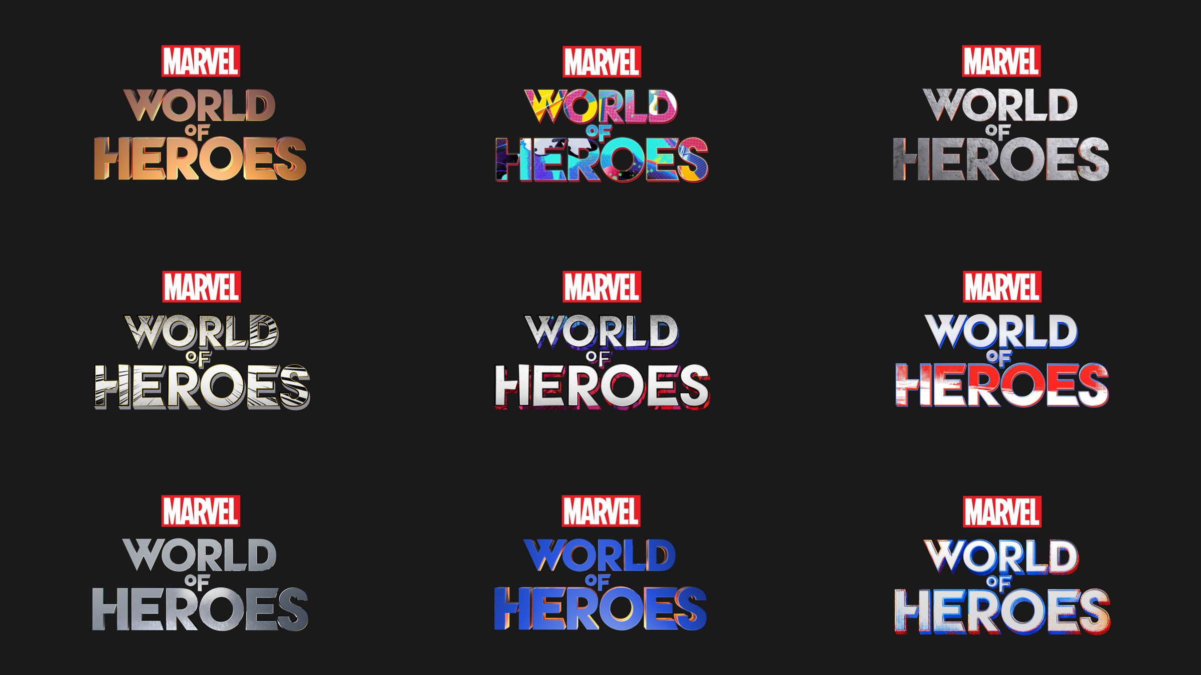
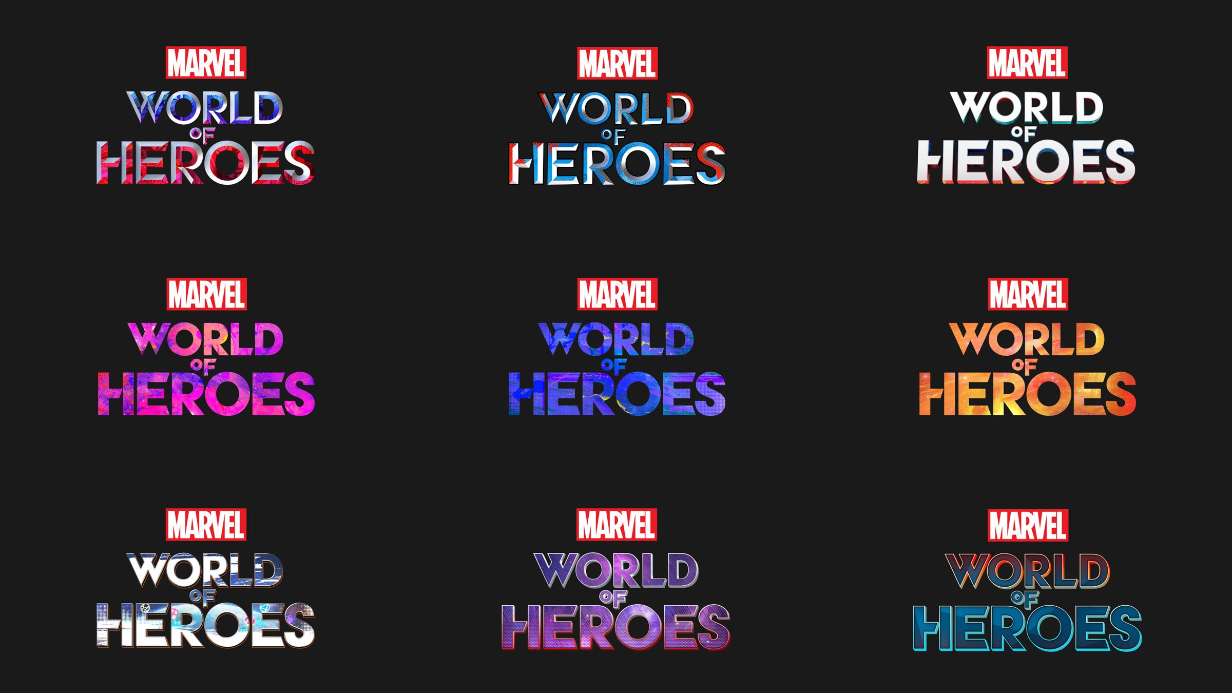
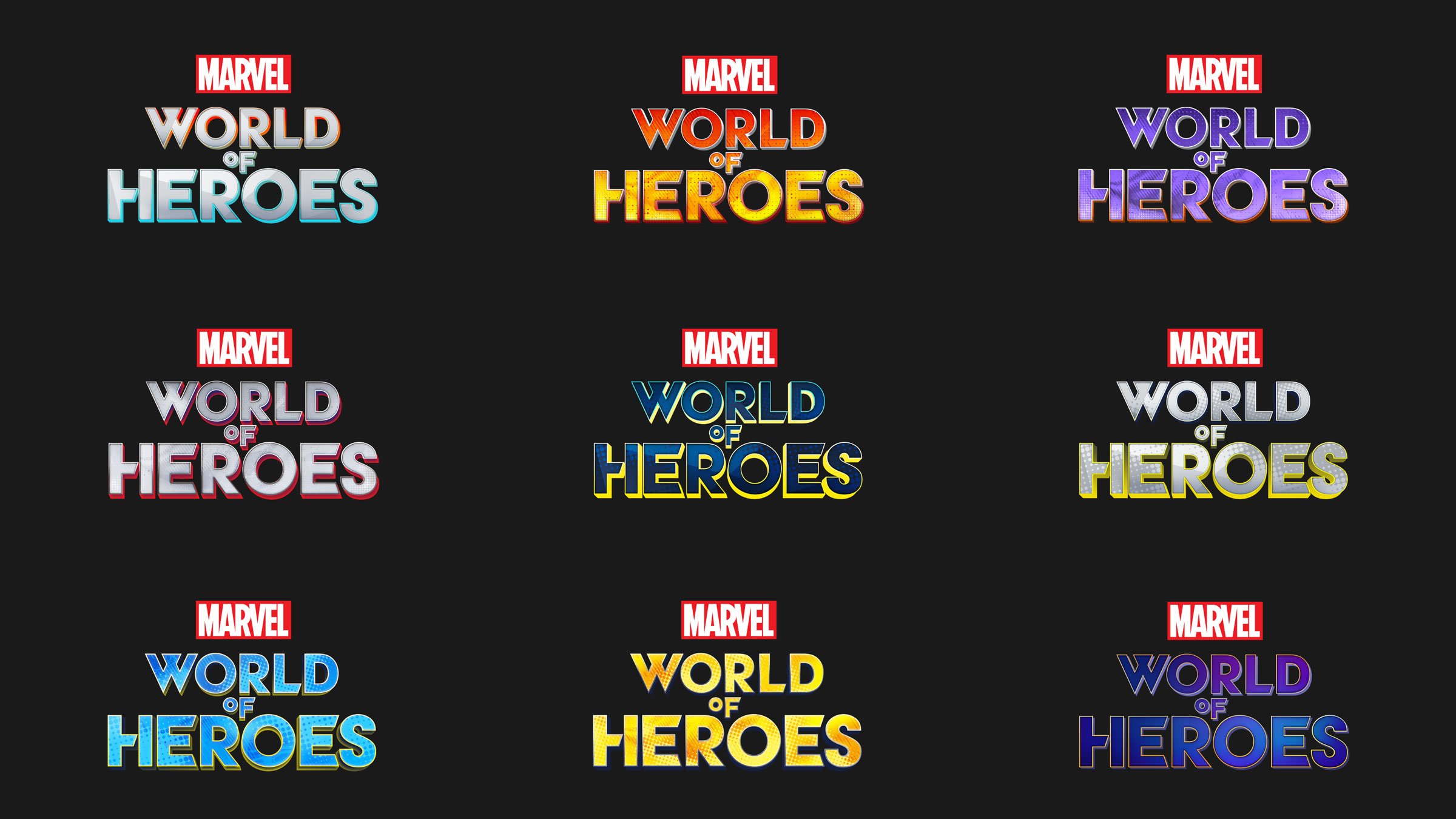
Color Treatments
We applied a wide range of color treatments within the logo design, paying homage to the multiverse feature of the game — and the iconic Marvel Studios introduction video. Our original R&D work influenced and informed many of the color palettes and graphical elements within the logos.
Key Art


App Icon
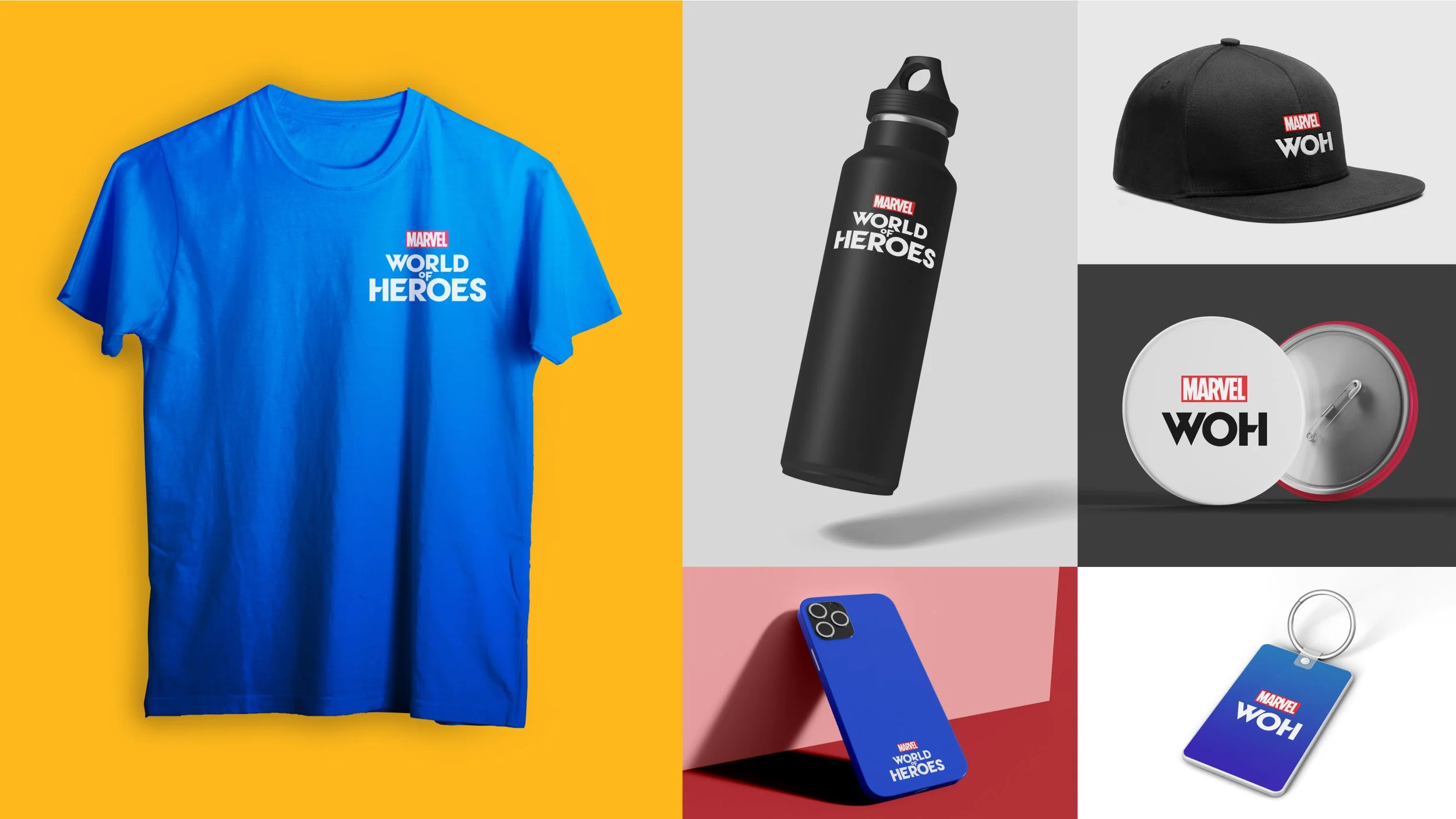
Merchandise Mock-Ups
15+ Visual Styles Explorations

Bound
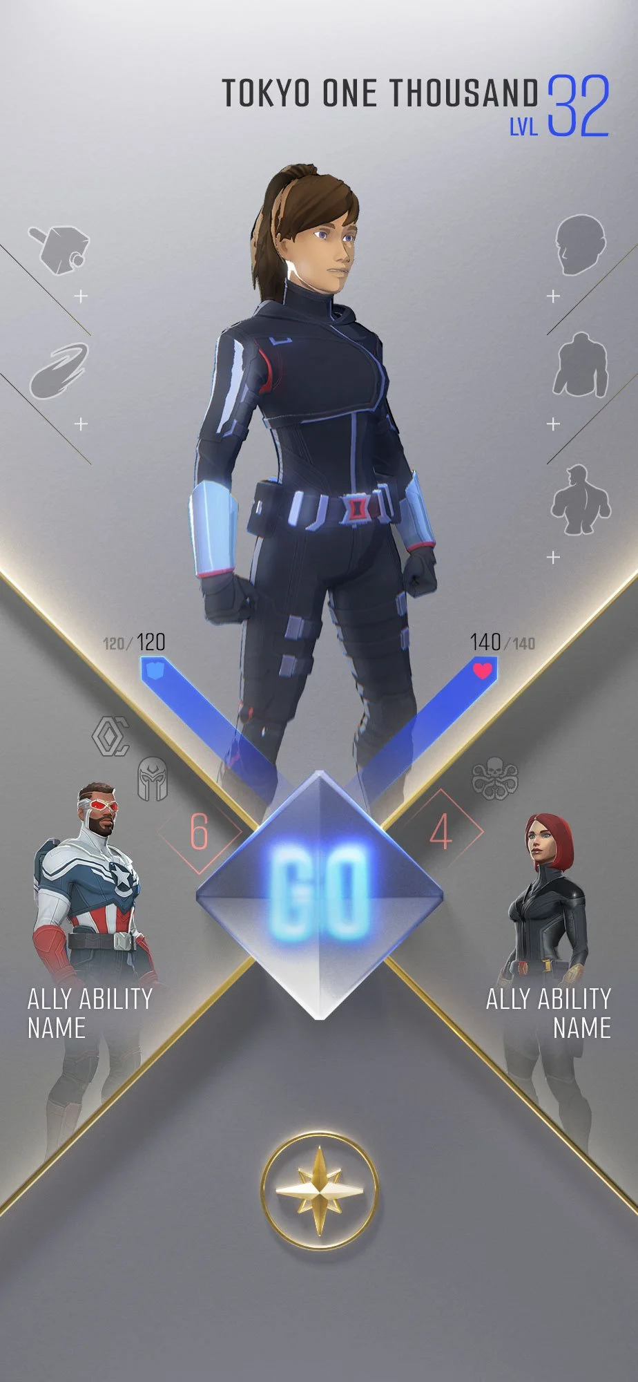
This style explores the 2D grid layout in depth. The essential commands are designed as 3D buttons and located on the top of the screen. We placed the UI contents in the infinity space behind it.
It is a playful and unique 2D and 3D space combination that transports the user into their imagination of the Marvel universe.
Bright Version
Display
The display is our intelligent approach to a clean layout, infusing a bold color palette into the theme.
The three-color system — Blue, Yellow, and Orange — indicates the level of the user, and it's also fully customizable.